A ‘Contact Us’ webpage is not merely the cherry on top of the cake. It is as important as the homepage or any other webpage because there is no use when your potential customers read all about you but don’t have a way to contact you. Having a website is great but 70% of small business websites lack a Call to Action (CTA) on their homepage and that is where they fall behind while converting a visitor into a lead.
Most websites follow a user experience design. It is a design that carefully guides the visitor to navigate through the webpages in the right order. The final destination for the user on this path is always the contact us webpage. When they land on this webpage, it means the visitor is about to convert into a lead.
Because the contact us is the last step and it is almost positive that the visitor will make contact, the webpage is sometimes disregarded in terms of design and content. But enhancing the contact us webpage will turn the almost positive into a definitely positive click on the contact CTA buttons.
To ensure that your visitors take the primary steps to become your customers, your efforts in making an efficient contact us webpage are crucial. Nudge your visitors to get in touch with you and give them a smooth experience while doing so. Giving them a smooth experience accounts in making your visitors comfortable and providing them with an easy way to contact you.
And that is why your contact us page should be beyond just good enough. Make it great. Here are a few tips to make the process, functional, easy, convenient and simple:
1) Include a Simple Contact Form

Contact forms can be painstakingly long or they can be simple and easy to fill out. Adding a contact form on your contact us webpage is a great way to source contact information from your potential customers. But keep in mind that nobody likes to tell you unnecessary details. Keep your form short with only the essentials of name, number/email address and their reason for reaching out to you.
Along with a contact form, give your customers what they want to know. A give and take approach is upright and loyal in everybody’s views. Give them your contact information and then ask them to share theirs for a higher rate of responses.
2) Include a Meaningful CTA
No matter if it is a ‘submit’ button at the end of your form or a ‘call us’ button in your contact information, ensure that your CTAs are meaningful and rightly placed. For example, people are accustomed to thinking of ‘no’ or ‘wrong’ when they look at the colour red. So, try not to use the colour red in a CTA button if you want your visitors to click on it. At the same time, people also associate red with love and passion based on where it is used. Utilize such design psychological principles and make your contact us webpage CTAs appealing and thoughtful.
3) Include Clickable Text

Make it as simple for your potential customers as possible. Make your phone numbers and email addresses clickable text. Or even better, include a button instead of adding clickable numbers on your contact us webpage.
A button with the words ‘talk to us now’ or ‘call us right away’ can be clicked by your website visitors to place a call. This process is much simpler than copying/writing your number and pasting/typing it on their keypads. It is a basic UX principle.
For every 1$ spent in UX, you get results in a return of 100$ according to a study by Forrester. Spend your resources in UX and make things convenient for your customers to get returns of 9,900%.
4) Include Google Maps

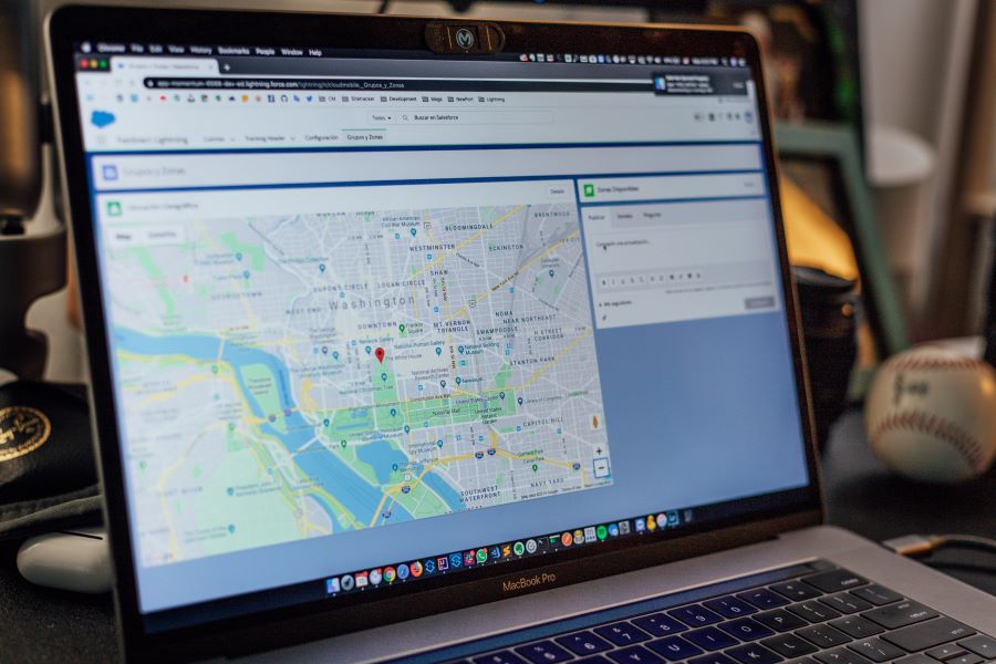
Along with adding your store or office address as text, embed a Google Maps to your location on your contact us webpage. Your visitors can simply pinch the map to locate you in their city.
According to Google’s global survey, 74% of in-store shoppers searched online before visiting a shop. When potential customers search for a brand online, there are higher chances for them to connect to your website if it has Google Maps embedded in it.
Adding Google Maps to your website not only improves your contact us webpage but also improves your SEO ranking at no extra cost.
5) Include Social Media Links
The forms of communication have extended beyond phone calls and emails with Gen Z and Millenials. They prefer reaching out to a brand via social media. Generation Z freely communicates, networks, and reviews and connects brands online and by online they mean social media. And Millenials have a high purchasing power. This makes it essential for your brand to include social media information on your contact us webpage.
Many contact pages are dull and boring. But it doesn’t have to be like that for your website. Giving your visitors a friendly feeling on your contact page will be a grand final step of your conversion funnel. Make your information readily available, follow an information hierarchy, place them cleverly in an appealing manner and attract more leads. Talk to our team of website designers and get started in designing a website with a great contact us webpage for your business.


